Gallery
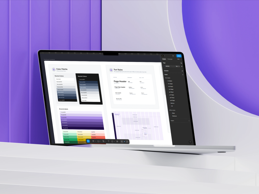
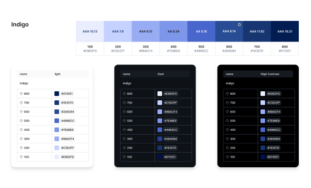
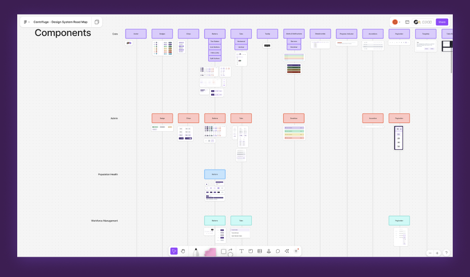
At Zyter, our UX team undertook the creation of a scalable and accessible design system to unify product experiences across the platform. The initiative aimed to provide a consistent UI language, support for accessibility (WCAG 2.1 AA compliance), and visual flexibility through Light, Dark, and High Contrast modes. The system would serve multiple healthcare applications used by diverse audiences, including individuals with visual impairments.
Zyter’s products relied on inconsistent UI components and patterns, making it difficult to scale or maintain a cohesive user experience. Existing interfaces did not meet WCAG 2.1 AA standards, creating barriers for users with visual, motor, or cognitive impairments. The platform lacked Light, Dark, and High Contrast modes, limiting usability across diverse environments and accessibility needs, while designers and developers struggled with misaligned components, unclear documentation, and inconsistent implementation practices.
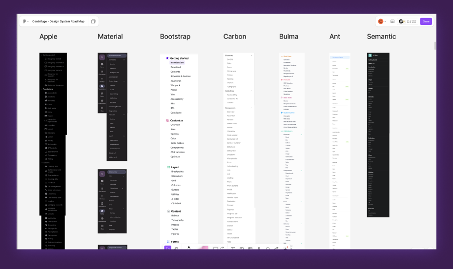
Product audit | Stakeholder interviews | WCAG research | Design system benchmarking
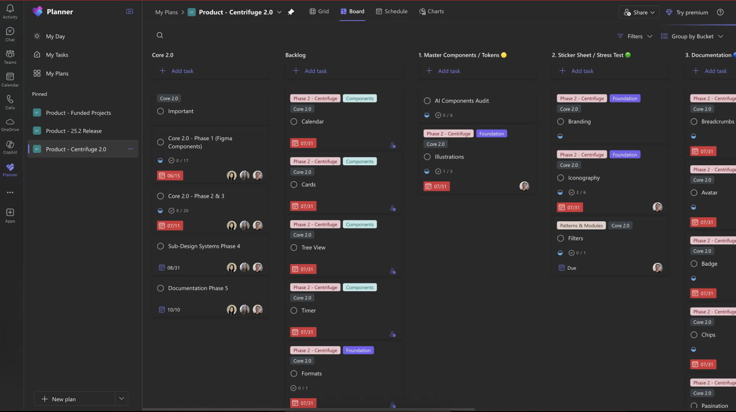
Project plan | Four-phase timeline | Agile sprints | Weekly developer syncs
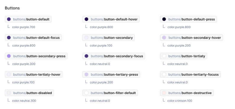
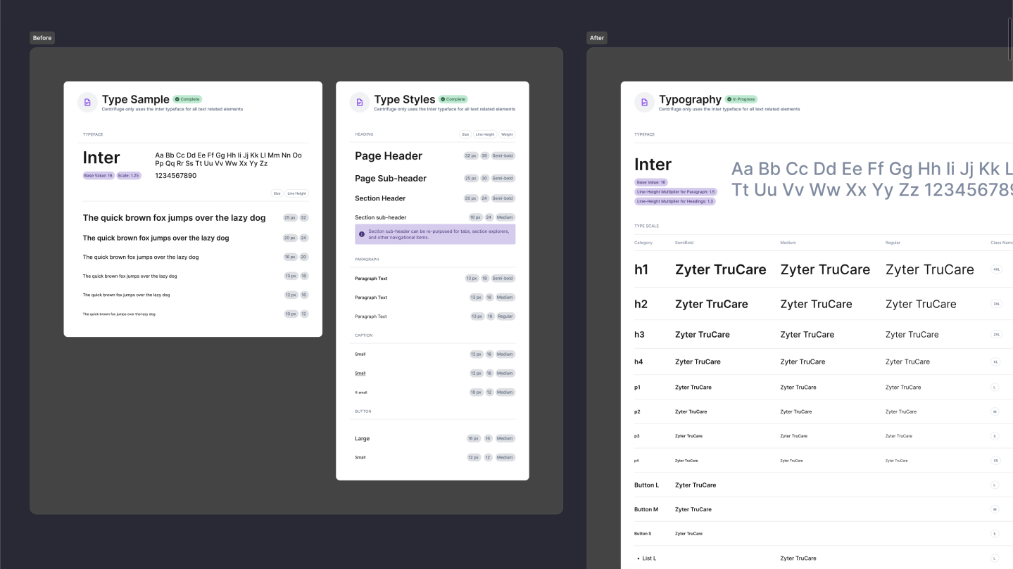
Modular typography | Accessible color palette | Spacing, icons & layout grid | Design tokens for theming
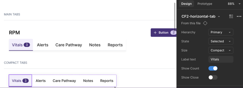
39 reusable components | Forms, patterns & modules | Light, Dark & High Contrast themes
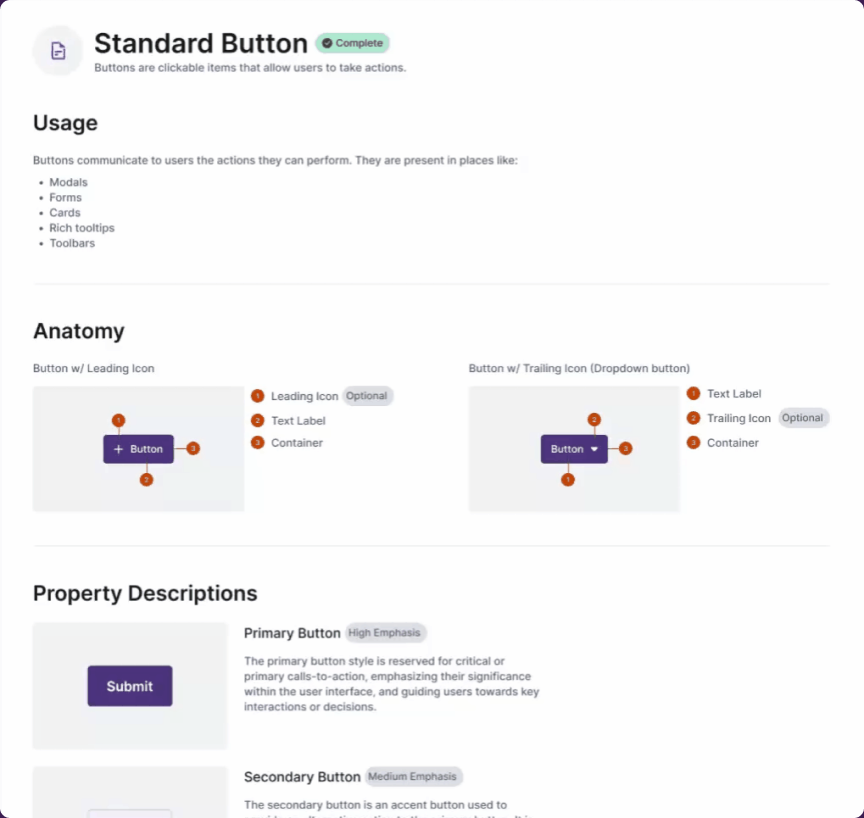
VoiceOver, NVDA & keyboard testing | Axe & Lighthouse audits | Documentation & walkthroughs