Gallery
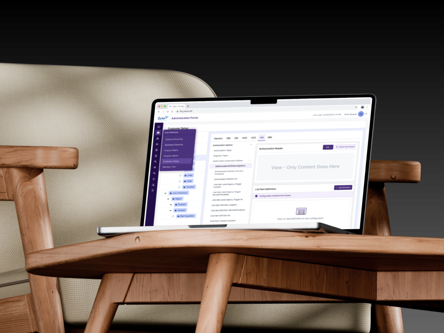
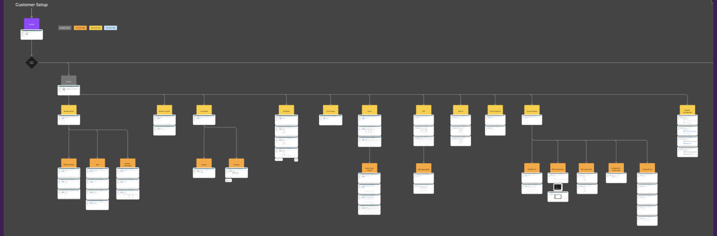
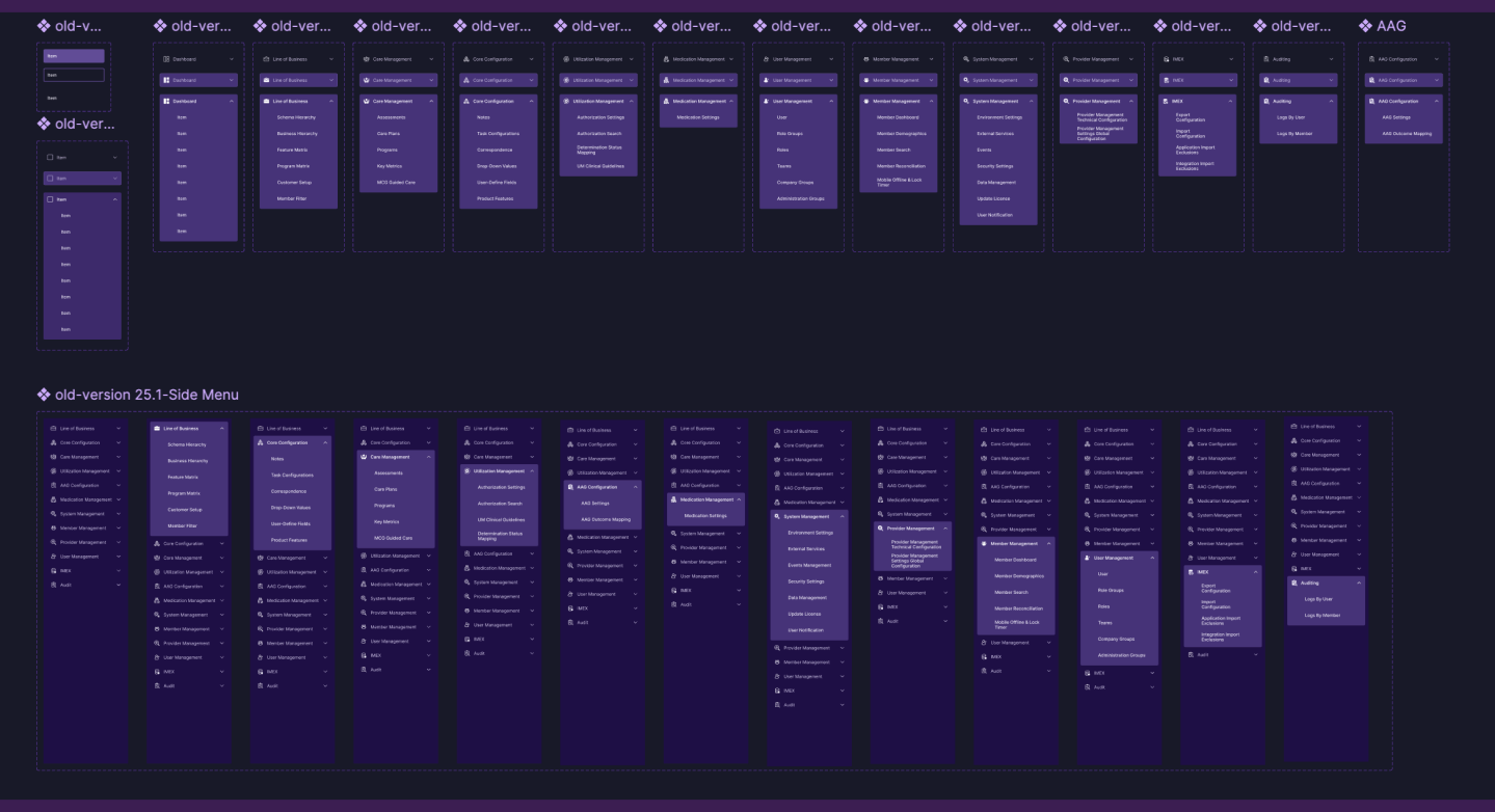
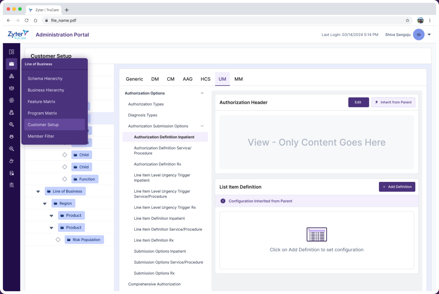
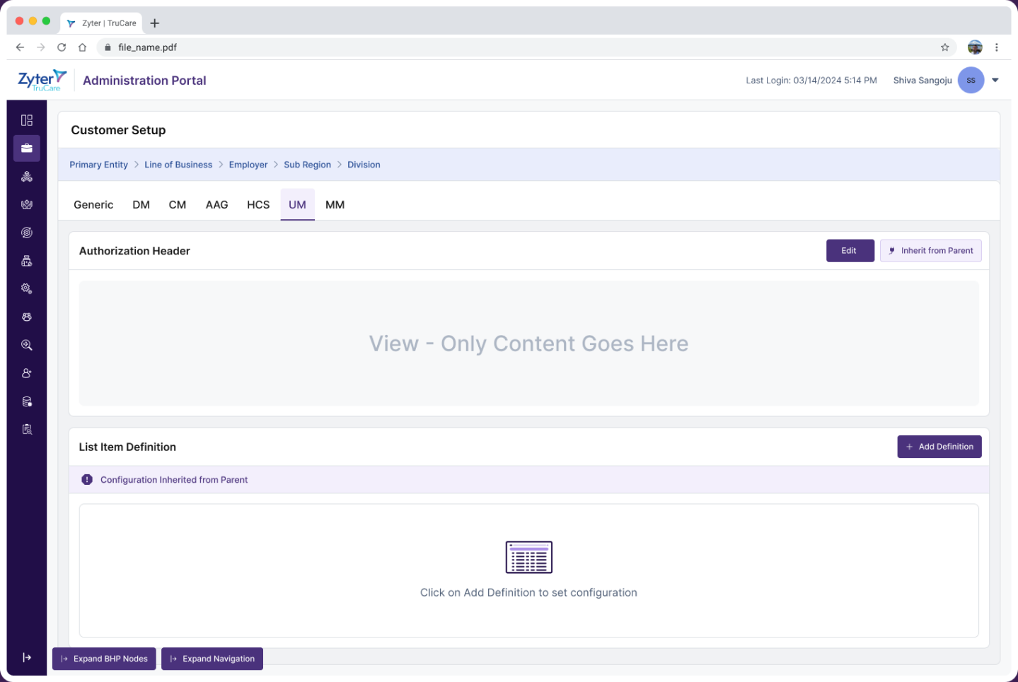
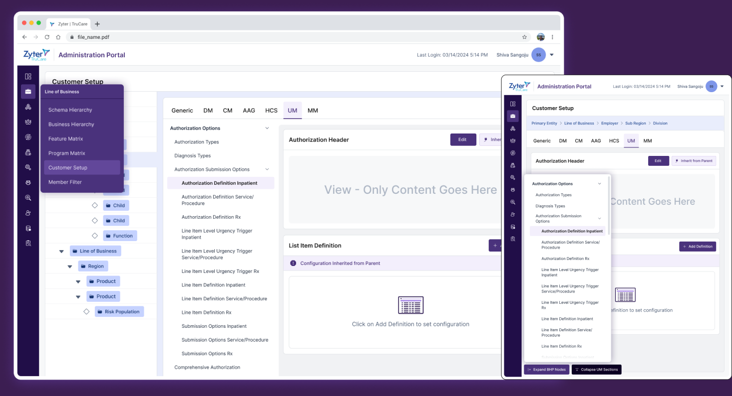
Zyter’s legacy Admin Portal was inconsistent, hard to navigate, and inefficient for healthcare administrators. Users struggled to complete key tasks due to fragmented workflows, poor hierarchy, and limited visibility into critical data. The goal was to redesign the portal to streamline operations, ensure UI consistency, and create a more intuitive, efficient user experience.
Research surfaced six recurring pain points: overwhelming navigation, inconsistent UI elements, lack of clear status indicators, redundant data entry, accessibility gaps, and visual clutter. Users needed quick access to priority information such as pending tasks, patient alerts, and case statuses, while the legacy portal lacked visual clarity and workflow transparency. Inconsistent layouts increased the learning curve, redundant inputs caused frustration, and basic, unreliable search made it hard to locate patient records and critical data.
Stakeholder interviews | System audit | Heuristic evaluation | Usability baseline
Insight synthesis | Pain point mapping | Shared goals & principles | Deliverables
User personas | Flow diagrams | Modular information architecture
High fidelity wireframes | Responsive breakpoints | Design QA
Engineering syncs | Continuous design audits | Iterative adjustments | Accessibility support